Addressing the critical need to clearly articulate Pega's unique market differentiation, I led the creation of an immersive interactive webpage for pega.com. This project leverages three engaging, animated modules that strategically compare customer journeys with and without Pega technology. By bringing real-world scenarios to life, the experience effectively demonstrates how Pega augments operations, leading to superior business outcomes and a distinct competitive edge. Collaborated closely with SMEs, strategist(Zoe Kazmierski), copywriter(Anna Kramer), to craft a visually rich narrative that powerfully conveyed Pega's capabilities.
Lead digital design, Art direction, Wireframes, QA
Pegasystems
2019-2020
During my time at Pega, one of the first projects I was part of was to improve the overall website experience. To do so, we wanted to bring more interactivity to the website, to build more brand awareness especially for the first-time visitors.

As I started to take over from wireframes to visual design stage, as well as gathering insights from our product, product marketing, and development team members. I started to put together a list of problems I tried to solve for this project:
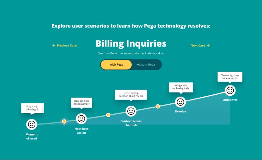
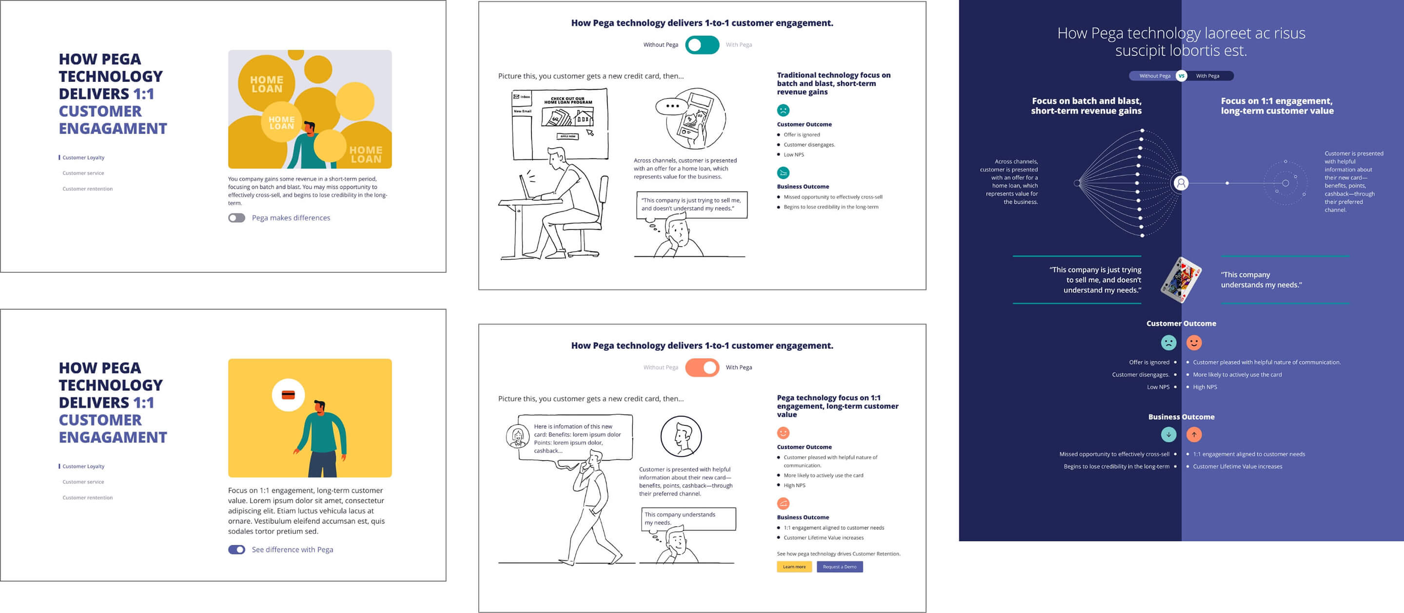
After several discussion across teams, we decided to use “billing inquiries” as our sample story for the initial design. Design wise, I started to explore in multiple visual direction while still keeping the key elements from the original wireframes.
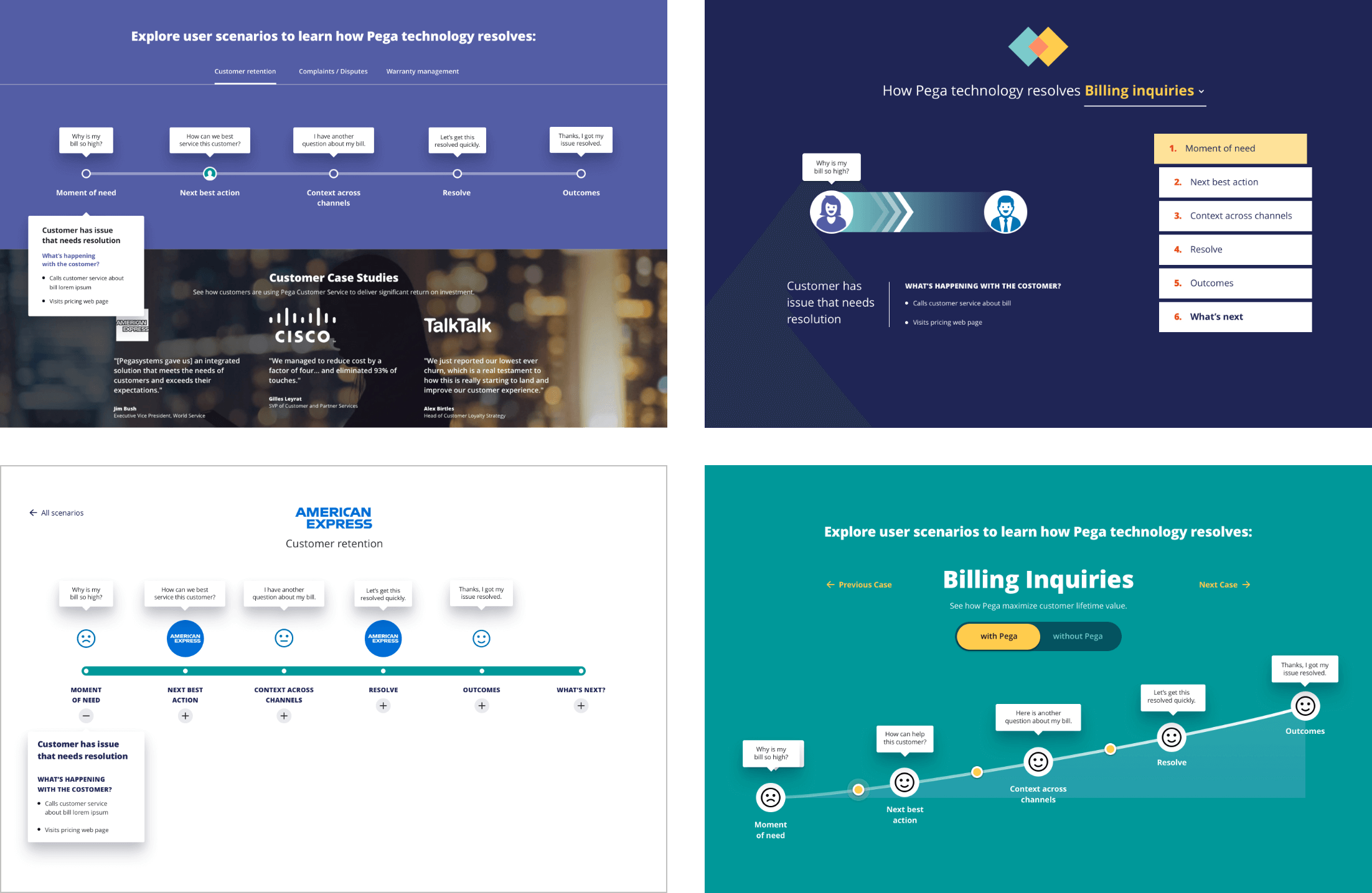
The team agreed on moving forward based on #3. With multiple rounds of design update, the design was finally coming together.
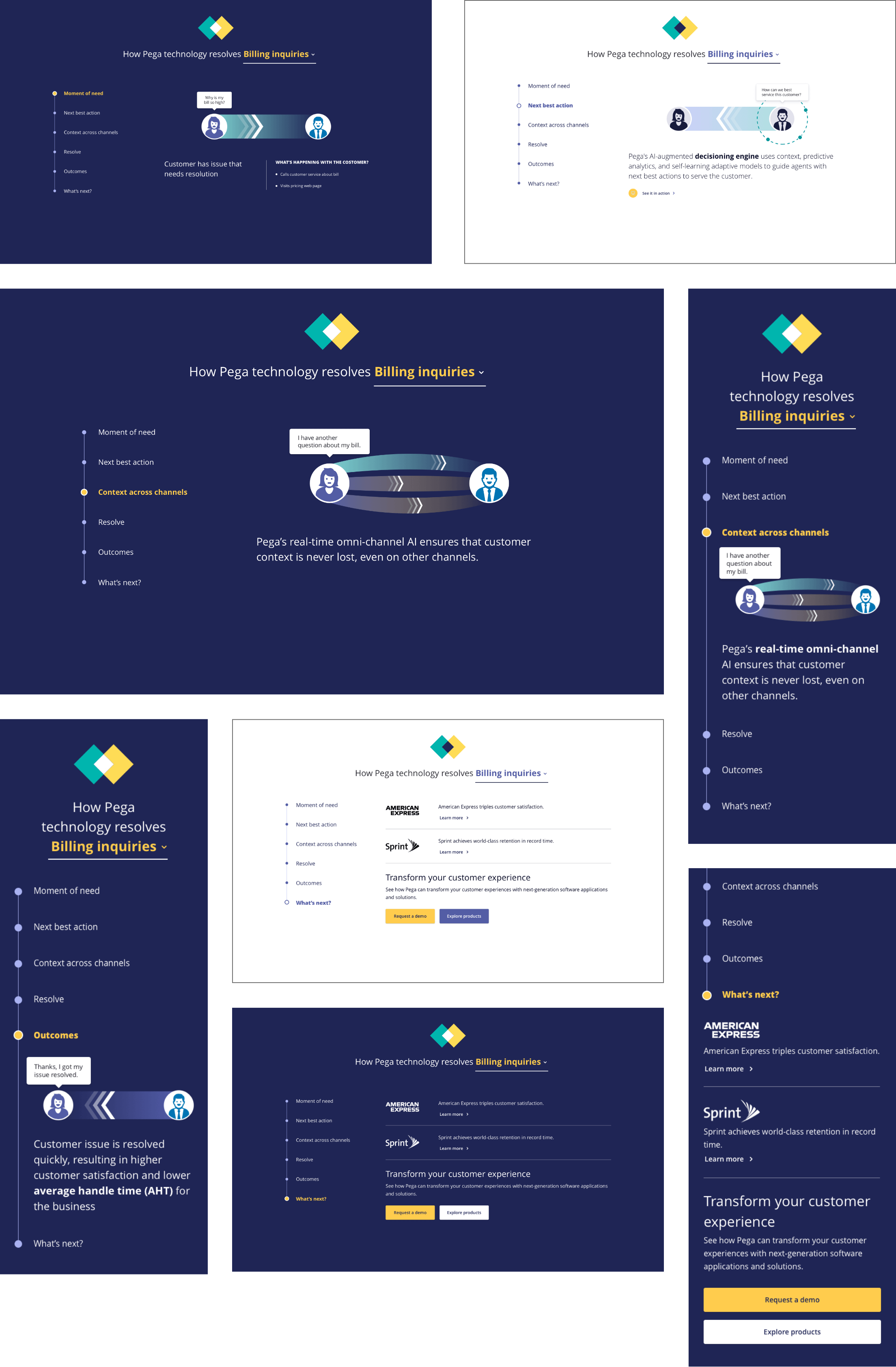
With stakeholders on board of the design, it’s finally time to audit the whole design under a microscope. I documented a detailed breakdown for our development and publishing team.
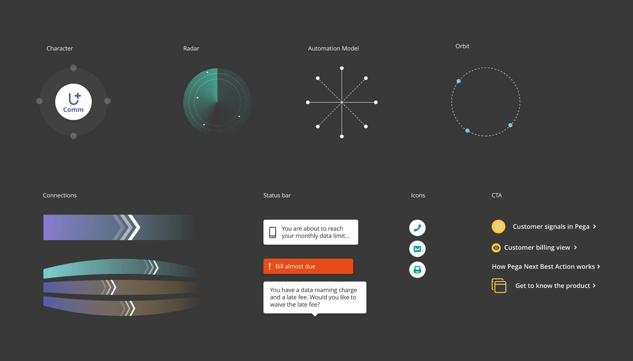
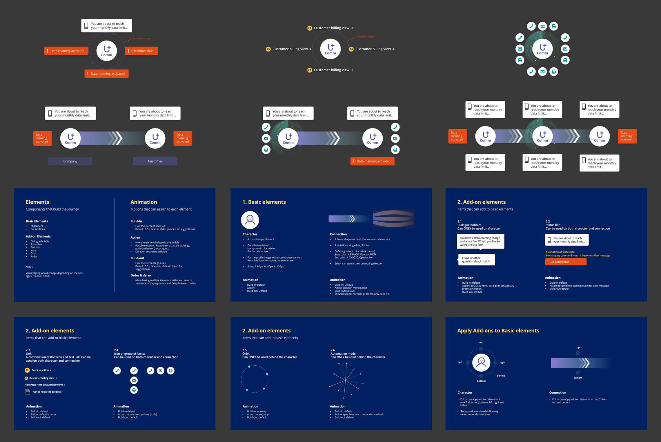
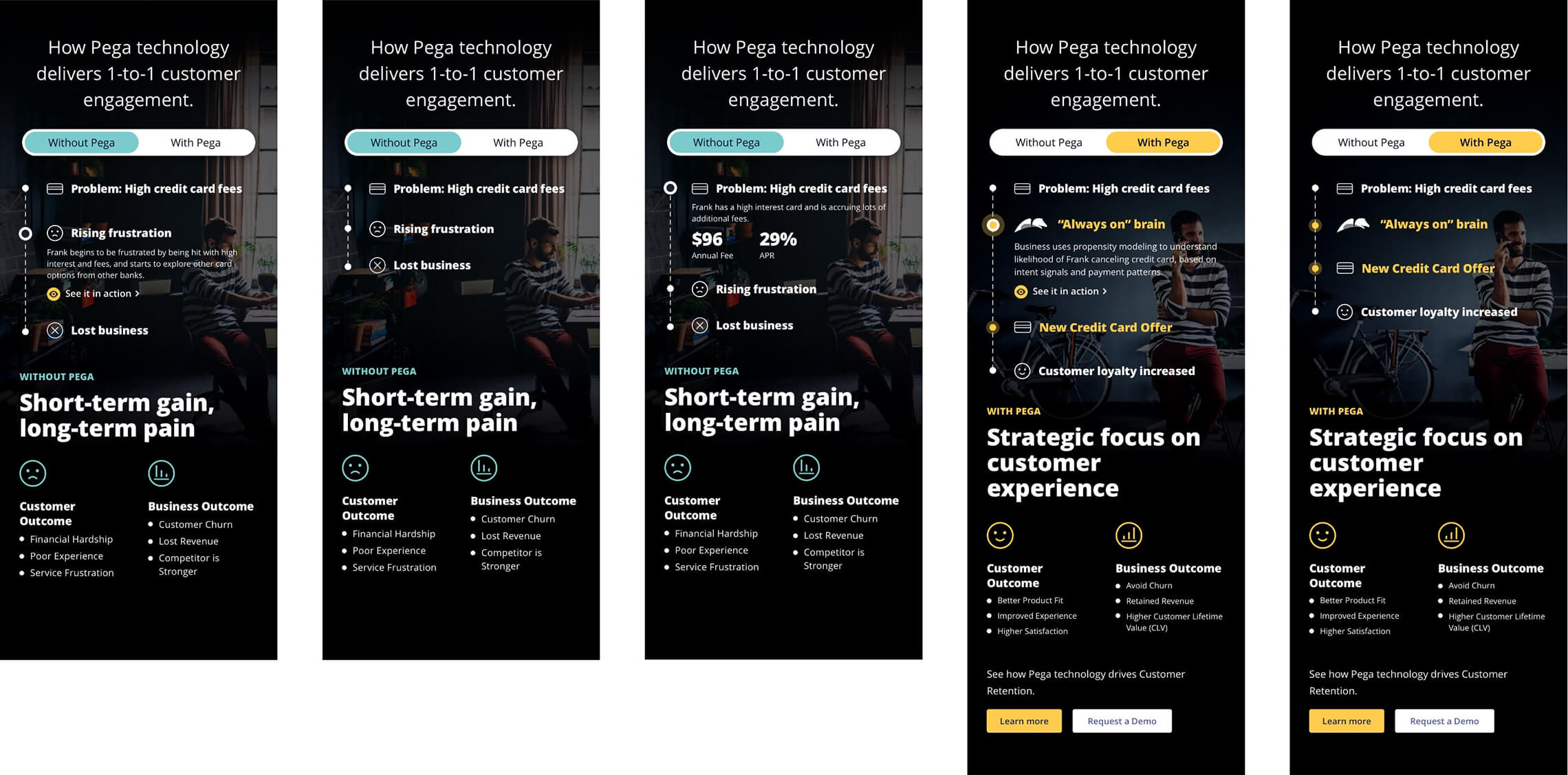
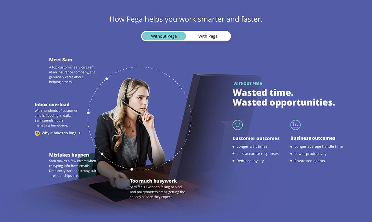
During the early design review, stakeholders also loved the idea of a “toggle” that can be turned on/ off a Pega technology layer in the storytelling.


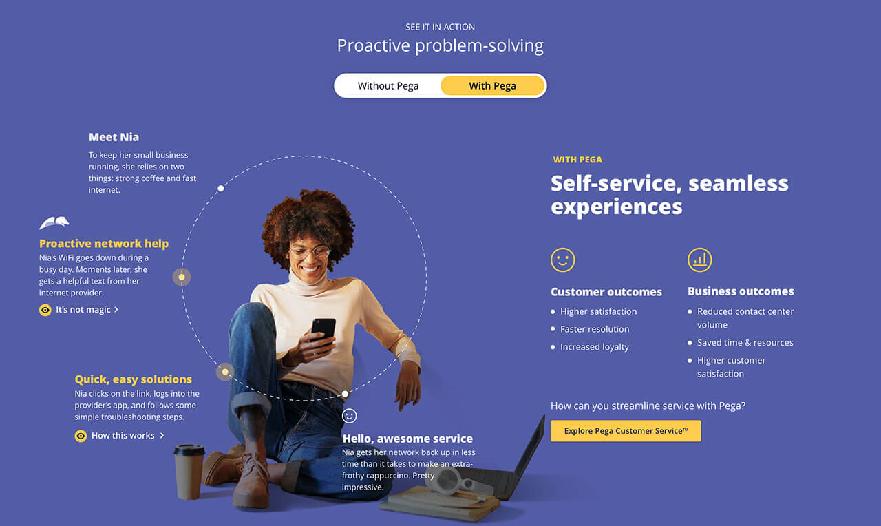
Both projects are a very ambitious from design to development. It was great collaboration across teams. We eventually launched both interactive pieces in late 2020, both units became popular content on our site.
With/Without Pega is the most popular content on the page both by individually clicked element and overall section.
Till this day, we continue to craft new stories using these frameworks.
We built a great relationships with Product and Product marketing team through the process, and it led to us to collaborate a new interactive projects.
The violet color was added into the Pega brand style guide.